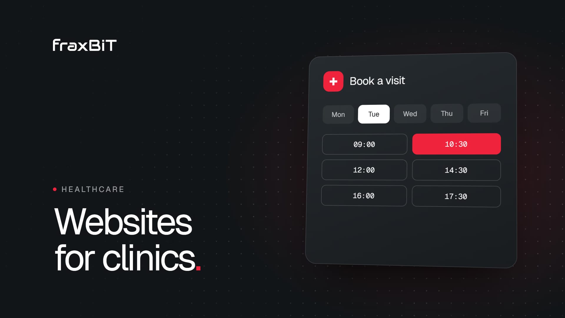
A healthcare or clinic website brings in new patients when it answers their first questions in seconds: what you treat, who will treat them, what it costs or how pricing works, where you are and how to book. Everything else (design, SEO, content) exists to make those answers easy to find, easy to trust and easy to act on, especially on a phone.
This guide walks through what patients look for, the trust signals that matter, the technical basics that decide whether you are found at all, and the mistakes that quietly send patients to the clinic down the road.
What patients look for first
Most people visiting a clinic website are not browsing. They have a symptom, a referral, a result to collect or a family member to help. They want to confirm five things quickly:
- Do you treat my problem? A clear list of services, specialties and conditions, each with its own page when it matters.
- Who will see me? Doctors and clinicians with names, photos, specialties and qualifications.
- What will it cost? Prices where you can publish them, or a plain explanation of how pricing works: insurance accepted, consultation fees, packages, what is covered and what is not.
- Where and when? Address, map, parking or transit notes, opening hours, holiday hours and whether you offer evening, weekend or home visits.
- How do I book? One obvious action: book online, call, or send a short request.
If any of these takes more than a scroll or a tap to find, you lose people who were ready to come in. Put the booking action in the header and repeat it at the end of every service page.
Pricing without the guesswork
Many clinics avoid pricing on the website because fees depend on the case. That is understandable, but silence reads as "expensive" or "hidden." Even when you cannot list fixed prices, you can explain the structure: what a first consultation includes, which insurers or schemes you work with, whether a referral is needed, and when the patient will know the final cost. That small section often answers the question that would otherwise have been a phone call.
Online booking and contact options
Patients choose different paths depending on urgency and comfort. A good clinic site offers several, without cluttering the page:
- Online booking connected to the scheduling tool you already use, reachable from every page.
- Click-to-call on mobile, with the number visible in the header.
- A short enquiry form for questions that are not bookings yet.
- Messaging options such as WhatsApp, if your team actually monitors them.
- After-hours handling, so a call at 9pm does not simply ring out.
Missed calls are one of the most common leaks. Front desks are busy, and patients who reach voicemail often try the next clinic on the list. An AI receptionist such as fraxBOT can answer missed and after-hours calls and book appointments, so the phone channel stays open when your team cannot pick up.
Trust signals that actually earn trust
Healthcare is a high-trust decision. Patients judge your clinic by the website before they ever meet your team, so the site has to show real people and real credentials.
Team bios
Give each clinician a profile with a professional photo, full name, role, specialties, qualifications, languages spoken and, where relevant, registration with the professional body. A short line about their approach helps more than a long list of conferences. Real photography beats stock images every time.
Accreditations and memberships
Show the accreditations, licenses and memberships your clinic genuinely holds, ideally with a link to the issuing body so patients can verify them. Never display a logo you are not entitled to use. If you are unsure whether you may display a mark, ask the organization that issued it.
Reviews
Link to your Google reviews or embed them honestly. Do not cherry-pick by editing text, and check the rules that apply to patient testimonials in your country, since some regulators restrict how they can be used in healthcare advertising.
Accessibility and mobile speed
Your patients include older people, people with low vision, people in pain and people reading on a cracked phone screen in a waiting room. Accessibility is not a nice extra here. It is the job.
Practical basics:
- Readable body text with strong contrast against the background
- Large tap targets for phone numbers and booking buttons
- Full keyboard navigation and correct labels for screen readers
- Plain-language headings that describe what each section is about
- No auto-playing video, flashing elements or pop-ups that block the page
Designing to WCAG 2.1 AA guidelines is a sensible target. On our own healthcare projects that is the standard we build to, as described on our healthcare website design page.
Speed matters just as much. Most patients search on mobile, often on patchy connections. Heavy page builders, oversized images and third-party widgets slow everything down. Aim for green Core Web Vitals, compress images into modern formats, and question every script you add. A fast site is also easier for search engines to crawl and rank.
Local SEO: be found where patients search
Most clinic searches are local: "dermatologist near me," "dental implants in [city]," "blood test open Saturday." To show up for them, you need a few things working together.
| Element | What to do | Why it matters |
|---|---|---|
| Google Business Profile | Complete every field, choose accurate categories, add photos and keep hours current | Drives map results and many "near me" searches |
| Name, address, phone (NAP) | Use exactly the same details on your site, profile and directories | Inconsistent details weaken trust signals for search engines |
| Location pages | One page per clinic location with address, hours, map, team and services offered there | Lets each location rank in its own area |
| Service pages | One page per treatment or specialty, written for patients | One generic services page cannot rank for dozens of searches |
| Structured data | Schema markup for your practice, locations, services and FAQs | Helps search engines and AI assistants understand what you offer |
| Reviews | Ask satisfied patients for reviews in a way your rules allow, and reply professionally | Influences local ranking and patient choice |
Groups with several sites face extra complexity. Our pages on hospital website design and dental website design cover how this changes for larger health systems and dental practices.
Medical content quality and E-E-A-T
Google treats health content as "Your Money or Your Life" material and looks hard for signs of experience, expertise, authoritativeness and trustworthiness (E-E-A-T). AI assistants such as ChatGPT, Perplexity and Google AI Overviews lean on the same signals when choosing which sources to cite.
What that means in practice:
- Name the author and the reviewer. Every medical article should show who wrote it and which qualified clinician reviewed it, with a link to their profile.
- Date your content. Show when a page was published and last reviewed, and actually review it.
- Answer real questions first. Start each page with a direct, plain answer, then add detail. This is what both featured snippets and AI answers quote.
- Cite reputable sources where you make factual claims, such as national health services or professional bodies.
- Stay within your scope. Explain conditions and treatments in general terms and always point readers to a consultation for personal advice.
Avoid thin pages written only to target keywords. A shorter page written by your clinicians will outperform a long, generic one.
Privacy and data protection for forms
Clinic websites collect personal data, and health data is among the most sensitive categories there is. The rules differ by country. In the EU, the GDPR applies and treats health data as a special category. In the US, HIPAA may apply depending on what you collect and who handles it. Other countries have their own laws.
This is not legal advice, and you should confirm your obligations with your own legal or compliance adviser. In general terms, sensible website practice looks like this:
- Collect the minimum. A contact form needs a name, a way to reply and a short message. It does not need symptoms or medical history.
- Keep sensitive data off the website. Let your compliant booking system or patient portal handle intake, rather than storing medical details in a website database or inbox.
- Be careful with tracking. Third-party pixels and analytics on booking or condition pages can expose sensitive information. Privacy-friendly, cookie-free analytics are worth considering.
- Secure everything. HTTPS everywhere, updated software and limited admin access.
- Explain it clearly. A readable privacy policy and clear consent wording where your rules require it.
Serving multilingual patients
If your patients speak more than one language, your website should too. Machine translation alone is risky for medical content, so have key pages translated or reviewed by a fluent speaker, ideally a clinician.
Good multilingual setups:
- Give each language its own URL with proper hreflang tags, so search engines show the right version
- Let visitors switch language from any page without losing their place
- List the languages each clinician speaks on their profile
- Translate the booking flow and forms, not just the homepage
Our healthcare clinic website project, a doctor-at-home service, is a good example of a site built around fast contact for patients who need help quickly.
What to avoid
The patterns below appear on clinic websites again and again, and each one costs patients:
- Brochure language. Jargon and vague phrases like "comprehensive care solutions" tell patients nothing.
- A buried booking path. If booking lives only on a contact page, many visitors never find it.
- Stock photos of smiling models. Patients notice, and it undermines trust in your real team.
- One page for every service. You will not rank for specific treatments, and patients cannot confirm you offer what they need.
- Pop-ups on arrival. Newsletter boxes and chat widgets that cover the screen on mobile drive people away.
- Outdated information. Wrong hours, departed doctors and old prices damage trust faster than anything.
- Claims you cannot support. Avoid "best clinic" claims, unverifiable success rates and before-and-after images that your rules may not allow.
For calmer, support-focused services, the wellness support website shows how tone and clarity can matter as much as features.
Bringing it together
A clinic website that brings in new patients is not complicated, but it is deliberate. Answer the five first questions clearly, show real clinicians and real credentials, make booking obvious on every page, keep the site fast and accessible, and build the local SEO and content foundations that help both Google and AI assistants recommend you.
At fraxBIT we have spent more than 7 years designing and building websites from scratch, including healthcare sites for clinics, labs and wellness services. If you want to know where your current site stands, run our free website audit for a quick check of SEO, mobile speed and AI search readiness, or get in touch to talk through your clinic.
Keep reading
Web Design6 min read
How to choose a web design agency: questions to ask before you sign
The prettiest portfolio is not always the right partner. These are the questions to ask, the red flags to watch for and a simple way to compare proposals.
Read article
Web Design8 min read
Custom website vs template: which one does your business need?
Templates are fast and cheap, custom sites sell harder. Here is how to tell which one your business actually needs, and the middle ground most growing companies should consider.
Read article