Case study · Finance
Financial Dashboard.
UI/UX design for a finance dashboard: a clean, white-themed interface that brings complex financial data into one clear, actionable view.
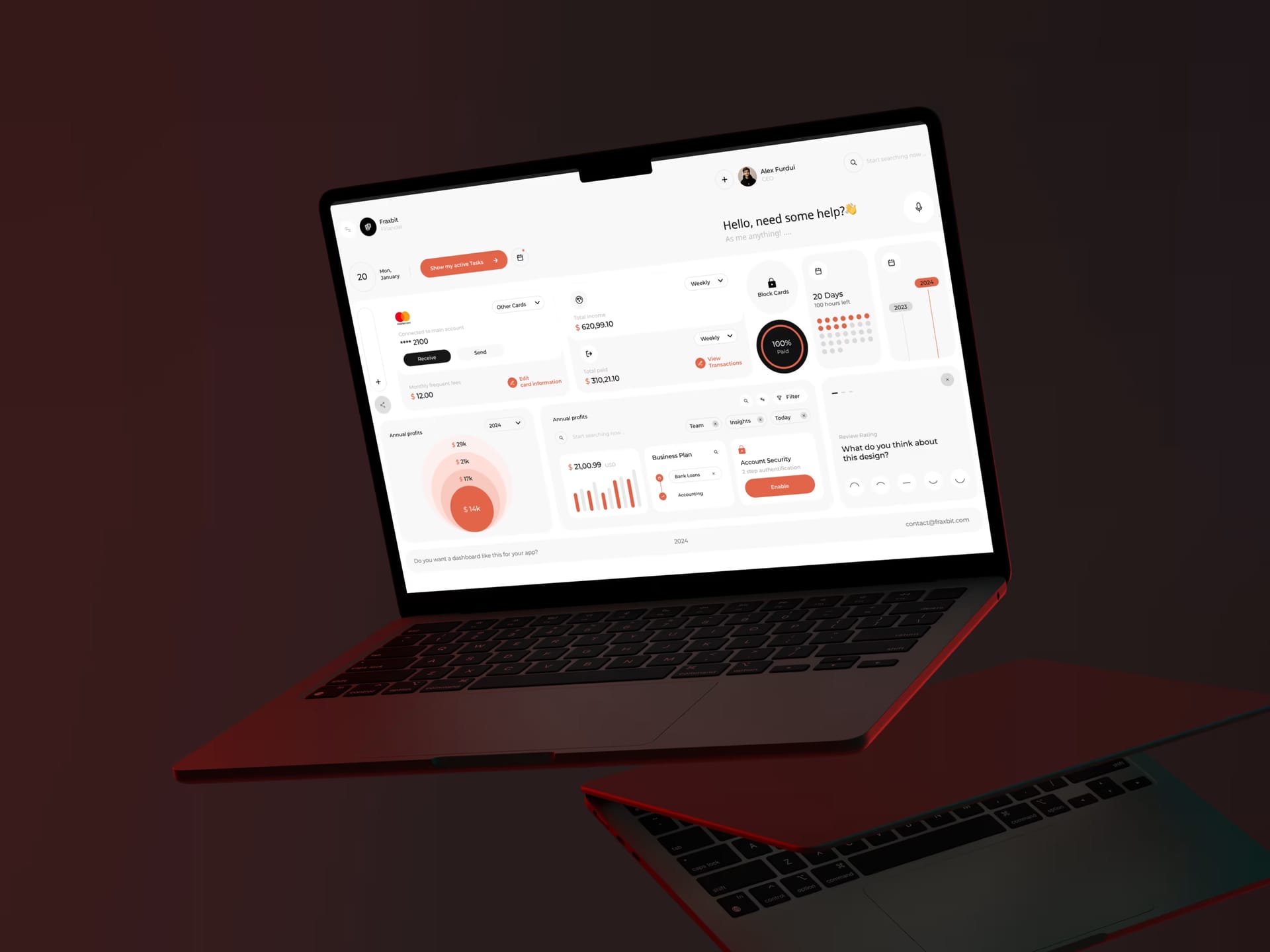
Case study
The challenge.
The client needed a centralized finance dashboard where users can monitor performance, understand what the numbers mean and act quickly. The data was complex and plentiful, and the interface had to make it feel simple and trustworthy.
- 01StructureOrganizing large volumes of financial data into a logical layout that supports fast decisions
- 02Minimal but clearA white, gray and black system with orange accents that still keeps a strong hierarchy
- 03One screenFitting every critical metric into a single dashboard without overwhelming users
- 04Guided readingVisual cues that lead the eye through metrics, trends and actions
- 05Modular growthA framework that accepts new features and data modules without disruption
Case study
The impact.
The final dashboard brings every essential financial metric into one clean, modern view, helping users understand performance and act with confidence.
- Data clarityA structured layout and strong visual hierarchy that make numbers easy to read
- Faster decisionsAll key metrics centralized in a single, intuitive dashboard
- Trustworthy lookA polished white, gray, black and orange aesthetic
- Less noiseSimplified navigation and fewer distractions
- Scalable systemReady for new features and growing data needs
Behind the build
How it came together.
- Timeline
- 4 weeks
- Engagement
- UI/UX design
- Delivered
- Figma UI design & interactive prototype
- Design system & developer handoff
Get started
Let's build your next standout project.
Turn your idea into a digital presence that looks premium, loads fast and wins better clients.
Tell us about your project
A few details are enough. We'll take it from there.